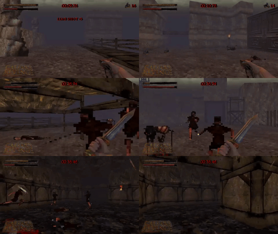
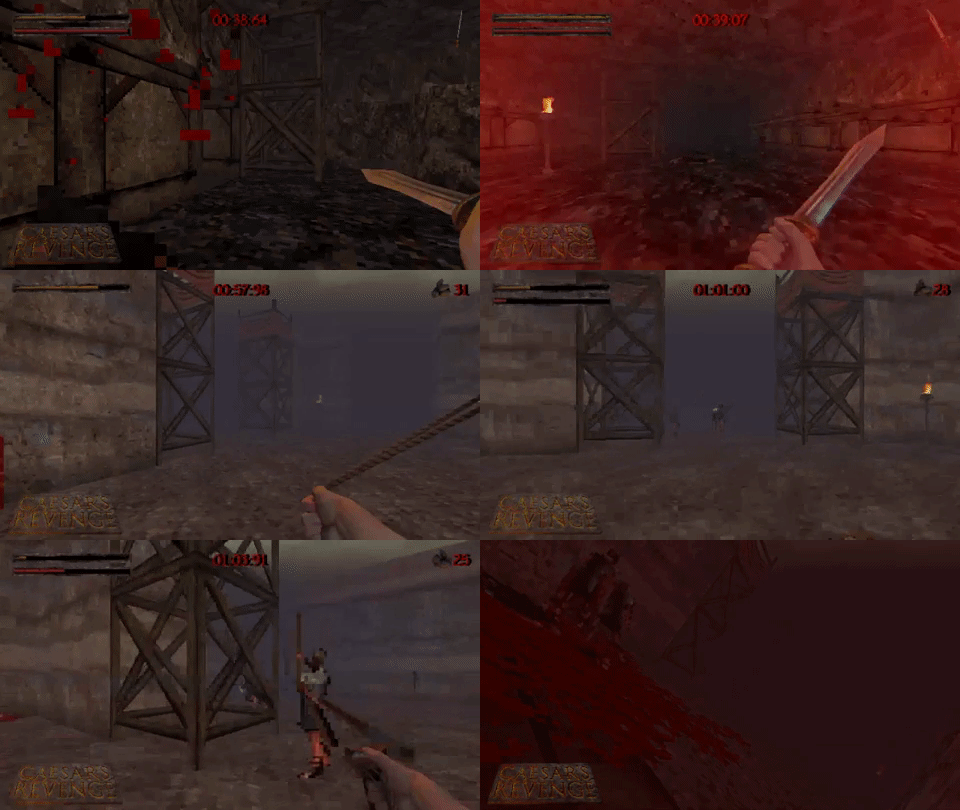
The Road to Release

Greetings everyone, we have received our final approval from Steam and Caesar’s Revenge is set for release on August 30th! This update covers some of the work we have completed leading up to release.

Achievements

The game will launch with 41 achievements. Some track the player’s progress towards important milestones, while others are earned through things like completing time trials, finding secrets or by discovering creative ways to dispose of enemies. We have opted for achievements that support the game experience and encourage exploration – there are a few easter eggs but we have stayed away from anything too tedious. Now that the system is set up it is easy enough to add more in the future.

Time Trials

We have set the time trial times for all of the levels in the game. We hope that they are challenging but also possible for the average player to achieve. We did experiment with setting some really tough dev times but decided that they should be fun for most players to try to beat (also because there is unlockable content based on them). We do expect world record times will be a lot faster than what we have settled on but we are happy to leave those to the speed running community!

Shield Spearman Balance

Some of the most frequent feedback from play testers was around the difficulty of the shielded spearman enemy. We’ve made a number of changes to make this enemy type more manageable:

  • Spearman collision mask reduced to make them easier to strafe around.
  • Spearman vulnerability angle increased, making it easier to hit them around their shield.
  • Spearman range halved – this was very over tuned and allowed them to hit the player from an unfair distance.

Beyond the direct nerfs, the arrangement of the final game will better ease the player into these encounters as there is an introduction and a level before the point that the demo started.

Player Spear Range

We have increased the range of the player’s spear by 25%. This should make a more interesting choice between the spear and the gladius while making it easier to fight mid-range enemies.

Collisions


The player collision code has been improved. Now the player will slide around enemies much more freely. This makes it easier to move in tight rooms and also makes circle strafing much easier.

Projectile collisions have been rewritten to be more accurate. This also solves a few bugs that were present (though not obvious) that could cause projectiles to miss enemies at close range, and another bug where projectiles could travel through walls.

Usability

Several updates have been made to make the gameplay experience smoother and more customisable. Some of these features have been in for some time (such as remapping controls and sensitivity) but there are some new additions too:

  • Maximum field of view increased by 30% (for those who like to play in a fishbowl)
  • Camera/head bobbing can now be disabled
  • Options menu can be accessed from the main menu (before the game starts).
  • Save files now compatible with Steam Cloud
  • Game now pauses when the Steam overlay is open if the player is in a level
  • Game now pauses when controller disconnects

Lever Glow

We are not opposed to players needing to explore but it is frustrating if you find where you need to go but miss the lever to open a gate.

Levers are often signaled by props, banners, and level dressing to draw the eye to their position. We also tried increasing the texture contrast but found that due to the way fog fading works, it didn’t make much difference.

We have now added a glow to the levers to make them more obvious through the fog. To keep it tasteful the glow reduces when you are close – this should help guide players through levels without too much hand holding.

Armor UI

The previous user-interface for the armor bar was quite confusing – it was a gray overlay that extended over the health bar. In theory this made sense but the way it was implemented looked more like negative space – as if the health bar was now depleting from the opposite end. We have replaced it with a chain mail overlay which is much more thematic and easier to read – a neat advantage of the chainmail is that you can also see your standard health bar through it.

Traps

  • The spiked barricade hitbox reduced by 33% and changed from a rectangle to an ellipse. These static traps are meant to zone the player to a degree, but the 2d sprite made distance hard to judge so they have been made a bit more forgiving.
  • The wall spike traps (found in Library) have new collisions to make them feel better (and fairer). Before, running into the spikes at any point would damage the player. Now, spikes that are already extended block your movement but don’t do damage – health is only lost if the player is hit by them while they are extending.
  • Fixed a bug where grinders didn’t register as trap kills for the achievement
  • Fixed bug where boulders would deactivate off screen and then would start rolling again if the player reapproached them.

A Note on Gameplay

The game description is updated to include the phrase “die-and retry” to better communicate the game loop to potential players. While it is a retro fps, the design does deviate from the more explorative, ‘campaign style’ shooters out there. We want to ensure that we attract players who want this kind of experience. Below is some of the rationale for the design:

Each level starts the player without any weapons (though one is normally provided). This allows us to highlight different weapon compositions and create more varied level designs (eg. a bow only level, or maps with limited or excessive resources). It also helps with balance and time trail times since levels can’t be trivialised by hording ammo. This is also important because most FPS games can throttle powerful weapons through ammo pick-ups which is tricky when many of the weapons are melee.

Levels don’t have checkpoints because the loop of the game is about learning the maps then completing them in a single run. Once learned, most levels are only a few minutes long, so this focus isn’t as daunting as it first appears. Secrets are also hidden throughout levels to provide resources to make encounters easier if players want to take things at a slower pace (sometimes these include dramatic boons like health regeneration or extra lives).

We hope that this new phrasing helps to indicate the kind of gameplay experience that the game offers. It is also worth noting that the demo jumped to levels throughout act I and while the ‘die-and-retry’ aspect is still relevant, the final games difficulty curve is a lot smoother.

Full game content

We have achieved our goals for release with 33 finished levels, 20 enemy types + bosses, a ton of traps, weapons, tile sets, bonus content and an original soundtrack. This project has been in development for a long time, and we are excited to see it finally release. Thank you to all the supporters who have stuck with us throughout development and followed the project’s process over the years. We’re looking forward to the August 30th release!

Caesar’s Revenge Demo Launches at Steam Next Fest

Today, we break our silence not just with whispers of progress but with a clarion call to arms: our demo is launching at Steam Next Fest! We are hoping to give a taste of the game before its eventual release this year. If you have been following for a while, please consider wishlisting the game to help boost our visibility.

https://store.steampowered.com/app/2166150/Caesars_Revenge/

A Glimpse into the Demo

Streets of Rome: Wander the alleyways and avenues where the shadow of the Senate looms large. Here, the heart of the empire beats with danger and opportunity, setting the stage for your quest for vengeance.
The Library: Knowledge is power, they say, and in the hallowed halls of the Library, you’ll find more than ancient wisdom lurking in the shadows. Prepare for a battle of wits and weaponry.
The Aqueduct: An engineering marvel becomes a battleground on the Aqueduct. Here, water flows like the blood of your enemies—relentlessly and without mercy.

demo_gif

We invite you to step into the sandals of a resurrected Caesar, seeking revenge on those who betrayed him. The demo is but a taste of the vengeance to be had! The levels in the demo are set in Rome and are drawn from the first act of the game. The full version will have 30+ levels that span across the ancient world with a broad range of enemies, traps, and weapons within them.

Live Streams

As part of the festivities, we will be doing two live streams to play the game and chat with the community:
8:00pm February 5th EST
3:30 pm February 11th EST
We will be playing the demo but we may delve a bit further into the game to give a sneak peak of what is to come. Both events will stream from our Steam page.

Devlog IX: New Weapon, War Pigs and Priests

This update brings a new weapon, effects and additional enemies to the fray. Behind the scenes work continues with presentation and options features being added. We have had a very motivated and productive few weeks with a lot of general progress on levels.

Sica

Matt
The Sica have been loitering in WeaponWednesday™ limbo for almost 10 months. They were initially created to fulfill Ivan’s hunger for dual wielding, offering a more interesting alternative to dual gladius. Sica in real life are not directly Roman but were used by Romans to a lesser extent than the Gladius or Pilum. They were more popularly used by peoples surrounding Rome primarily the Dacians, Albanians and Illyrians. The reason they have been so long in the making is due to rigorous and extensive gameplay and animation alterations. I planted this idea early on that Sica looked a lot like a boomerang, but this felt too farfetched at the time. However, as we struggled to balance and make the Sica feel fun the idea become more and more appealing. Ivan animated the attacks, the primary of the Sica being a flurry of cuts, all in quick succession – it is faster than the gladius but can only slice one enemy at a time. Initially the alternative fire was a scissor-like finisher but it was slow and under utilised considering how much more effective the primary attack was.

This is when the boomerang idea came boomeranging back out of the past, smacking into the game design, firmly lodging itself into the head that is the team’s psyche – the perfect solution for our problem. All according to plan! I grinned. Jordan threw together a prototype and before we knew it Ivan had the animations ready to go. The alternate fire is now a boomerang it can be thrown and returns, quickly becoming the perfect solution to pesky shield bearers. Unique now in comparison to all other weapons in the fact that it has infinite ammo (since it will always return to you) on top of being a powerful melee weapon. While thrown can still use a half strength primary attack with a single sword which adds a layer of strategy: when to throw, when not to throw, based on each enemy encounter. All up, an awesome addition to Caesar’s arsenal for sure!

Blood effects

Ivan
In the latest build, we did a third pass on the blood particle effects. This effect has been both a thematic and technical tug of war throughout the entire project. Considering that Caesar does a lot of killing in the game the blood effect needs to satisfying and clearly communicate a landing of a hit. Conversely, considering you are encountering many enemies in the game we can’t afford to have too many particles and effects due to frame rate considerations. This new iteration is both efficient on particle count while also being more visceral than the previous wall and mid-air splashes. The new textures have been hand painted in Paint Storm Studio with its new pixel precision feature.

Priest

Jordan
While this unit has been in the game for sometime, it is worth writing about at this point as they have become one of our key enemies. Priests don’t have any offensive abilities but revive fallen units to rejoin the battle. When approached, they teleport away from the player, making them tricky to dispatch. This makes for interesting target priorities as while they are harmless, they can end up causing a lot of trouble if left unchecked. The strength of this enemy is that they can be paired to any enemy type in an encounter to create compelling dynamics from level to level. For example, simple enemies like archers and swordsmen play very differently when augmented by one or more priests. Trivial enemies become real threats when revived as quickly as Caesar slays them. This design is continuously engaging as enemies are recontextualised throughout the game, giving this unit a lot of longevity. This is also the unveiling of some of the more magical elements in the game – Roman and Greek mythology will be in abundance.

War Pig

Matt
We talked about war pigs two years ago when discussing enemy types and it was more a joke than anything. I thought this day would never come – it was impossible they said, silly they said, but low and behold the team has come around and it happened. To my reluctance I spent Saturday making the War Pig, this time thinking it was silly, but oh how I was wrong. The War Pig is epic! Despite how silly it sounds, war pigs were real; Romans used them in warfare against war elephants. The elephants didn’t like the sound of the pigs, the way they moved, and of course the fact that they were on fire. Covered in pitch they would be set alight and bolt towards enemy lines causing the elephants to flee and inflicting casualties on their own forces as they trampled them down in a panic. Our war pigs are not burning, instead (and more humanely) they are carrying an explosive payload, trained to attack then detonate on command by those cunning senators and their legions. Caesar is sure in for a surprise. The pots they carry are the same as static explosive pots to make the pig read better on your first encounter with them. The pig itself acts as a sort of a homing missile but just like the static pots, the pig can be used to inflict damage on their own troops if detonated early. The pig was modeled, rigged, animated by me then and implemented by Jordan all within the day, hell of a Saturday!

Bug fixes

Jordan
After Chromacon we recorded a substantial list of bugs to fix and tweaks to make – the kind of list that comes from playing a couple of levels for 16 hours. We have fixed all of the issues encountered at this point as well as a number of persisting flaws that we hadn’t got around to addressing yet.

Options Menu

Jordan
I have recently been working on implementing the options menu into the game. Philosophically, there is debate to be had around what controls you give the player given the amount of time is spent designing specific experiences. For example, letting players turn off the music can dramatically change the mood of a key scene. Right now the Gore on/off doesn’t actually function – we are considering keeping it that way since the violence of ancient Rome is imperative to the narrative of revenge. To what extent should developers afford user preference versus honed designs?

A good example of this is how FOV adjustment is an expected feature in an FPS – a customisable element that other genres don’t normally expose. This feature isn’t a given in platformers, RPGs and driving games, allowing gameplay to be consistent and designed both technically as well as experientially. High FOV gives a greater sensation of speed so if you are making a game that is supposed to feel fast, should you allow players to make it feel slower if they choose to? The best argument I have heard for dynamic FOV comes from an accessibility standpoint as a fast first-person camera can make players feel ill and making it adjustable can mitigate these effects.

In terms of game play in Caesar’s Revenge, a higher field of view makes movement feel a bit faster and provides more periphery to the view port. Overall it feels like a good feature to include since the slider lets players set it higher than the previous default. A small takeaway is that increasing this cap has thrown off some of our culling distances: there are areas in levels that were previously out of frame that now need to be extended – easy fixes but building future levels with the max FOV in mind will make the process cleaner.

We have been posting a lot of updates on our Discord, the server is still small but is going really well. For a more spoilery behind the scenes look, we are being much more liberal with what we post over there in terms of development and work in progress stuff.

Caesar’s Revenge at Chromacon

This weekend we exhibited Caesar’s Revenge at Chromacon. The event was a lot of fun and brought together hundreds of talented artists. It was especially exciting for us as it marks the first time we have showcased the game publicly. We collected a ton of feedback, found some new bugs and confirmed a number of suspicions we had around balance. The reception of the game was great and watching people play over the last few days has been really rewarding.

It is interesting balancing early levels in the game as that there are no health pickups – players can only recover by chaining enemies together to trigger bloodlust. This design encourages an aggressive playstyle where the game is fast, frantic and at its best. We playtested a few different early levels and will be working on tweaking the loop to help new players get a feel for the pace of the game. This is a delicate balance as we also want to keep the high difficulty curve intact.

Discord Server

Coinciding with the convention we are also launching our public discord server. We will be posting updates to the game as well as sharing a lot of day to day content that might not make it to the devlog posts. We don’t want to host a discord server that simply reposts gifs from Twitter – rather, we hope to run a lot of our design talks and interactions between one another in this space to let players peek behind the curtain as well as open up channels for feedback.

If you would like to join us use the widget above or this invite link.

We will be back next update with a focus back on development. Once again it was great showing the project off for the first time. A big thanks to the Chromacon team – if anyone reading wants to have a look at the art and video game scene in New Zealand, check out the other exhibitors.

Devlog VIII: Out of Hibernation

It has been awhile since the last update – the good news is that the project is alive and well! All three of us are working on the game in our free time so progress tends to come in peaks and valleys. Another reason for not posting is that we are spending a lot of time creating levels – content is proving to be the most time consuming part of development but is also the area that may be most important to get right. For this update we have updates around new level art, menu systems, music and more.

Level Art

A challenge of achieving the aesthetic of ancient Rome in a gritty, retro style is that iconic elements such as marble run the risk of coming across too bright and clean. Intricate interiors can also be problematic as a lot of details and embellishments become noisy at a low resolution. Recently we spent some time revisiting one of the early stages that we created to try and establish a better thematic aesthetic while still delivering on the grimy, pre-rendered look that the game revels in. The new street scenes maintain the simple geometry that are the building blocks of the game while utilising more props and texture variety to better situate the player in the time of Caesar. Some new props include washing lines, carts and furniture. Slanted roofs make an appearance and we are experimenting with more interesting skyboxes to render the environment less muddy. This is all a fine balance as over decorating a scene could end up detracting from the final result. Our main goal has been to create unique environments that facilitate fast and readable gameplay while also evoking their setting clearly.

Most of our design decisions have been informed to varying degrees by historic reference. This reference however, is often informed, adapted (and sometimes ignored!) in favour of our own intended art direction. Some examples of this are taking elements that clearly evoke ancient Rome but may be from a slightly later period than the game is set. The Sid Meier ethos of using the children’s section of the library for research resonates here in that we’re not aiming to create an accurate depiction of the time but rather to conjure that narrative setting in the player’s imagination.

Menu Screen Overhaul

menuscreencaesarNew menu screen offers a more digetic level selection with icons denoting level completion, secrets found and time trial achievement.

While we all liked the look of the old menu, we realised that it didn’t scale well to meet the needs of where the game was going (and the amount of content it would need to hold). A challenge of making a retro, low-res game is crafting a world from tiny textures and simple shapes while still instilling a sense of time, place and atmosphere. The old menu certainly fulfilled its function but missed out on significant world building opportunities. The new design places the levels on the map screen, diegetically situated on a table. This approach gives the player a better sense of place while introducing an opportunity to include more artwork to better set the scene. The game is currently planned to span across three acts, each with their own maps to create a stronger feeling of progression throughout the experience.

Moving towards this format has also opened up potential for better iconography to communicate ideas. A theme for our project has been ‘the excess of Rome’ – what better way to express this than an pre-rendered door that opens in place of a text-based exit button? The 90’s nostalgia also feels more distilled in this approach, harking back to the days of obtuse UI that may not be the clearest but certainly had a lot of character.

Many of the incidental props and pickups are much higher res than they appear in game. The pre-rendered map screen has the added benefit of giving us an opportunity to show off these more detailed props outside of their pixelated down scaling.

The custom font used throughout the game is of our own creation and the logo was made in 3D Coat. This approach allows us to easily play with lighting effects to achieve a distinctive result. One thing that a lot of early 3D games did was feature higher detailed renders than the real-time 3D in the actual game, something we wanted to emphasise in this logo. We are still iterating the design to balance readability and character.

Music


A Hateful Passage experiments with a more aggressive and spontaneous style, channeling the torment of the Roman underworld and drawing its name from the mythos surrounding the River Styx.
This track is more niche than the last one I posted and was written with the intent to lean towards the more intense end of the game’s score. This is an interesting challenge when the baseline comparison is already high-tempo and reasonably heavy. With this song I aimed to explore different time signatures and key changes that would push an aesthetic of dissonance even further. One option could have been to make the mix heavier though the overall cohesion between songs is also essential – while we aren’t strictly following a genre template, a lo-fi thrash sound defined the early musical direction and is a key pillar to each composition. This means that we are actively avoiding electronic parts and any audible synths (though there are some subtle supporting layers). Similarly, all of the songs are written in drop D which makes transitions and blends between atmospheric tracks more seamless. Overall I am very happy with how everything is sounding and how effectively these songs frame the game. Something exemplified by this track is the number of different changes and layers within its duration. The lack of vocals means that more generic structures risk becoming overly repetitive and given that this is a game where the player restarts a lot, sixteen bars of the same progression again and again could become tiring. In an attempt to mitigate fatigue, most songs avoid dwelling on one riff for too long and often jump between several ideas in short periods – an added benefit of this is how the sporadic blasts of guitars and drums reflect the intensity and pace of gameplay, crafting a cohesive experience between play and audio.

Devlog VII – New Traps & Armour

Ivan’s continued work on the high poly Caesar, looking somewhat more ominous than in the previous post.

Traps

This past week I have focused on making a variety of new traps for the game. Some of these introduce new mechanics and potentially systemic behaviors while others are more blunt in that they simply offer different ways to kill the player (or enemies!). Traps should require dexterity to overcome while being surprising and interesting. We previously had a handful of designs to play with but found they lost some effect when encountered time and time again. As of today the game now includes a total of eight traps that can be set up in a number of ways to challenge players. Some of the art isn’t final yet but a few of the newer traps are pictured below:

Crushers
Crushers move up and down and flatten anything that gets trapped underneath them. They can make for some interesting interactions when configured in sequence and are also useful in the ways their timing can divide spaces by blocking lines of sight.


Boulders
Indiana Jones? Tomb Raider? There is something about the classic video game boulder that while not exactly realistic, seems to fit perfectly into the gameplay of a retro fps as well as the pseudo-historic, hollywood-ancient setting of Caesar’s Revenge. One concern I had with implementing boulders was that our game is flat and the rolling might seem a bit far fetched. To solve this, all boulders drop from the ceiling and bounce a couple of times as they move which adds some authenticity to the motion. A happy accident of this approach is that they can also be set up to squash any unsuspecting opponents!


Swinging logs
… in perpetual motion! Although we’re not showing it now, these traps also have positional audio which makes it easier to identify its location when offscreen.


Rollers
Woah! I was on a roll with making these and thought it would be funny to try and make an iconic jungle roller from Crash Bandicoot. Turns out it is actually a lot of fun and one of my favorite traps at the moment. Will be interesting to see how level designs will contextualise this but I imagine it could be suitable for later in the game, in dark tombs or ruins.

Weather effects

The first approach used creates rain around the player using an array of coordinates to draw and loop falling drops. The buffer is large enough to make it feel as though it fills the whole environment while only drawing those in view. This is great for giving an overall level effect and is quite good for performance in that the weather is taking place only around the player – despite the impression of it filling the whole environment. One challenge of this method is that if levels include a lot of roofs and cover, then it becomes quite a bit more complex to work out where the rain should and shouldn’t be. For these cases of environments with a lot of indoor/outdoor flow, we have also created a regional weather system where you can specify the size and intensity of areas, all the way down to a single tile. This makes it easy to have dramatic changes such areas of cover in stormy weather.

Armour

An armour pickup system has been implemented into the game which will provide the player with a little extra protection (effectively an additional health bar). This is useful in a number of ways: it allows us to more finely balance difficulty in levels by managing availability of these items before significant encounters and introduce larger, high tension fights earlier on as the player can be given a small buffer to increase their survival. Additionally, armour can be placed off of the primary path and in secret areas to reward exploration – giving variety to the pickups. One thing we want to focus design wise is that often extra armour will be a little out of the way, meaning that players going for a time trial run will have more interesting decisions around getting these items or pushing forward without them. We have three types planned, the first of which has been completed. The Coolus is a type of Roman helmet prevalent in the time of Julius Ceasar.This example is inspired by, rather than being an exact replica of a coolus and is designed to match those worn by the in-game Roman legionaries. It is currently the mid tier item offering a 50 armour bonus.

Devlog V: Quarry Level Design

For the past few months we have been working on a number of levels. One of the most immediate goals for us is getting the first act laid out in terms of content so we can balance and polish to the point of a playable build that could be potentially released. For this post we wanted to showcase one of these levels – tentatively named ‘The Quarry’. There is still tweaking as well as additional art to implement but the bones are in place and hopefully documenting this stage of development reveals something interesting about our approach and process.

We needed a level that introduced slaves who can be freed to fight alongside the player. The obvious answer would have been a prison (which we will probably do at some point) but I wanted to branch out from the corridor focused texture sets we have been using so far. Both of these intentions were met by recalling the slave quarry scene from the opening of Spartacus (1960) – the setting fits thematically, mechanically and offers a new outdoor location that could be achieved within the limitations of our aesthetic.


The architecture and environment of the quarry is mostly made from rock formations with a theme of wooden scaffolding and makeshift structures throughout. The two main areas are the soldier’s camps and fortifications, the mining pit as well as a cave. Conditions in Roman mines were brutal. Many of these slaves were criminals known as “damnati in metallum” – which translates to “those condemned to the mine”. Other slaves in Rome could earn or purchase their freedom, these slaves however would work until their death.

In terms of gameplay, this level experiments with having the sling as a primary weapon as well as the gladius. So far we have used the sword as a staple starting point so introducing a ranged weapon with a bit of ammo management adds a bit of variety as well as strategy to the gameplay. The sling’s behavior was tweaked quite a bit to make it viable – running a level with a single weapon seems to be a good test of not just its usability but also fun factor. Currently the sling can be held for a strong shot or tapped for a faster but less damaging throw. This dynamic in addition to the extra damage dealt on surprise attacks makes for some interesting encounters.


The overall level is fairly linear and so the cave section breaks this structure by offering two seperate paths to take which should keep the level fresh on repeated plays. Both routes have a few pickups as well as allied slaves to free who will fight alongside the player (art is still being developed). An important design consideration was the placement of these benefits; they are far away enough from the fastest route to be of little use to speed runners but are also easy enough to find that players struggling with the level could go both ways to collect all of the slaves and items. This is a thought process throughout the entire game as we want levels to be challenging to speedrun but also provide options for players who want to take the game at a slower pace.

caesar'srevenge crucifixion
The game is very much a revenge story and so this opening shot of the level sets the tone of the tyranny and brutality of the senators that you are assassinating. Crucifixion was a method of punishment used in Ancient Rome. Mass crucifixions took place throughout Roman history with 6,000 of Spartacus’ followers suffering the torturous death after rebelling. Thematically this scene fits the context of a corrupt slave quarry as well as motivates the player to show little mercy to the ruling senator and his troops.

This level introduces a dog enemy type who runs quickly towards the player and alerts other units by barking. While not particularly high in health, the dog can be dangerous due to its high speed and potential to cause a chain reaction of opponents closing in on the player. This gif also includes a campfire with a roast leg. One of the great strengths of the Roman military over its opponents was superior nutrition. This versatile prop can be used throughout camp areas and provides a bit of flavour to the environment. I’m sure the dogs would love to sneak a bite!

Caesar's Revenge Dog

Something fascinating about making this game using GameMaker is the way in which 2D design sentiments translate to a 3D context. We’ve definitely been inspired by looking at Wolfenstien 3D editor and the intricacies of zoomed out video game maps. There is something very rewarding in laying out disgusting 2D sprites in a flat editor, then hitting ‘play’ and seeing the world come to life. Below is a side by side shot of the Quarry in editor as well as the same view in game through the 3D camera. Some new cinematic debugging features were implemented this week which definitely helps in capturing more dramatic screenshots – it is also quite strange seeing our flat-plane environments form a different angle!

That’s all for this post! It will be interesting to see how the level changes going forward as a lot of the balance depends on where it is placed in the game. We probably won’t do a post on every level like this (a little surprise is always good) but expect to see a few more areas being fleshed out in the coming months. If you would like to talk about the game, head over to our TIG Devlog.

Bonus content: Have you ever wondered how many stone quarries were in Ancient Rome? Have you ever wished you had a tabulated database and location map? Well, during research for this stage we found this great paper. Ben Russell has your back.

Devlog IV – Keys and Levers

This past week we have been working on gameplay scripting through trigger objects. This will allow for more dynamic level designs with the ability for us to create simple puzzles, traps and events in game that break up the general gameplay. An example of this are gates are activated by proximity and can be locked open or shut by various conditions. On the fly we are able to create gates that only open once, lock behind the player, are activated by a switch or even when enemies in a room are killed. Gates can control the flow of a level as well as offer an opportunity for gameplay scripting to create unique and memorable situations. Invisible triggers are used in conjunction to design this functionality but the same kinds of interactions can also come from switches.


We have had the functionality of switches in the game for a while but only this week have we finalised them into a suitable aesthetic. Previously we toyed with buttons but the lever look better suits the Roman theme and also stands out visually as a gameplay object. A cool feature about this design is that they will snap to the ground or walls depending on how they were placed. Interestingly, these are also the most complex 3D objects in the game in terms of draw code due to the multiple parts and octagon ends!


In terms of gameplay, a point of difference in our game is that levers can be activated by weapons – meaning you can fire an arrow down a corridor to activate a switch.


Doors are similar to gates in terms of gating progress and either open when approached or require a key to open. In terms of visual communication, doors and their corresponding keys will always look the same (iron key for an iron door) to ensure that players immediately understand what they need to find. While these mechanics are fairly typical of a classic fps we are also aware that their overuse can become worn out. For this reason not all levels rely on these mechanics and their focus is to open up creative level designs where spaces can be recontextualised and reused. There are also secret push walls that can reveal hidden passages. Unlike other games, these are activated by proximity rather than a keypress as we don’t want to encourage the tedium of pressing A on every wall in the level.


These keys were modeled after various Roman key finds. Roman keys have a wide variety of shapes and sizes all because lock making was in its infancy. Roman locksmiths had not yet figured out what locks worked the best and which were harder to break into. The majority of historical examples don’t even look like keys! Here are the photographs our keys were modeled after:


We have also been developing a variety of levels in different styles to get a feel for the gameplay over longer sessions. These stages are turning out to be a lot of fun and should be something we talk about in future posts.

Devlog III – Main Menu Interface

A unique aspect of this menu is that like the gameplay itself, the mouse control is along a single axis. In some ways this has made it easier to also offer keyboard as well as controller support as we don’t need to worry about a mouse cursor. At first we wanted all levels in one scrolling list but without a free mouse or scroll bar it felt weird. The next iteration was one long list of stages but too many items in a row looked a bit messy and ultimately would limit the number of levels to what would fit on the menu which would be a terrible idea. What we have decided to go with is an episode system – though we prefer to call them acts as it is more thematic as well as avoids any confusion with episodic releases.

For the background art we liked the idea of a burning Rome and experimented with a bunch of approaches. Originally we were going to go with a pre-rendered still (like the Age of Empires I title screen) but it distracted from the logo (which still needs some work on readability/contrast and the dagger. A painted look gives some balance to the rest of the game while conveying a strong mood. Three inspirations were the cd booklets you might find in metal albums – to emphasise a darker tone as well as the importance of individual tracks or in our case, levels. Second point of reference was intermission screens in old epics like Ben Hur and The Ten Commandments to evoke a sense of grandeur. And finally the third inspiration for the background images was Alphonse Muchas’s painting “Nero watching the burning of Rome” 1885-1886:
The image both has detail and an element of abstraction. A slight parallax on the background brings it all together and stops it feeling too static. Some more polish can be done but it is in a good place for now (the gif is a little cropped at the bottom, the actual spacing is much better).

Dagger

The menu features our current logo as well as a cool spinning dagger as the selection icon (perhaps one of the daggers that was plummeted into Caesar himself?). The pugio is a dagger like blade carried by all Roman soldiers. Identifiable by its wide blade shape. A lot of pugiones are speculated to have doubled as mini digging and multi-tools but their importance to Roman soldiers is unknown; perhaps a final backup after a javlin and gladius were lost.

Menu music

This piece is unfinished but is a style test of what we are aiming for with the menu music – the blending of darker metal with faux-ancient sounding instruments. The music in levels will be a lot more thrash-y with faster tempo so the menu is a good chance to take a breathe and set the scene. Here is the direction for the title screen so far:

Pause Screen

The game has a pause screen! I have never coded one of these myself before and it ended up being easier than I thought. How it works is the game takes a screenshot of the game then deactivates all of the objects in the game except the a controller which draws the screen grab with a transparent black overlay. Right now it is just showing the game is paused but later might include a menu selection to resume and quit (there won’t be saving mid level). I find it whimsical that it looks like objects are frozen when really we are just looking at a screen grab!

Save Data and progression

I have been working on the save file system. Data is now tracked and encrypted with the framework in place for tracking level unlocks, best times and other statistics. One thing we have been debating is whether or not weapons should carry over from level to level. This would be in line with classic shooters and gives the player a good sense of progression as well as making ammo usage meaningful. On the other hand, starting each level without a weapon opens some interesting level design possibilities (only bow, or melee only stages). This also incentivises players to use the weapons they find instead of saving them. A disadvantage of this however is that secrets are less important and people may not like having to start from scratch every time. All of this can of course be balanced around but currently needs some more thought.

Devlog II – Traps and Slingers

The featured image is some promotional art that Ivan unveiled this week – don’t forget you can check our development log over at TIGSource for smaller but more frequent updates!

A focus of our enemy design is that different units will stay relevant throughout, even into the late game. We don’t want to do recolours or higher health versions of the same types of enemies, instead difficulty will increase by the number of opponents as well as the unit composition of each encounter. With this in mind, even early game enemies can be deadly later on. One issue we were facing however was that early game units such as the archer become quite easy with the stronger weapons but we didn’t want to strengthen archers as they would be too powerful for new players. To solve this issue we have added a lower tier slinger to allow for early game ranged combat while enabling the archers to be stronger without throwing off the balance. We chose this enemy because it is less armored (lower hp) and in the game, will be shorter range and less precise than the Roman archer. The enemy was inspired by the historical use of auxiliary troops in the Roman military. These auxiliaries weren’t Roman citizens and would be paid considerably less than the Roman soldiers.

Slingers
While a slinger’s inaccuracy, low health and insubstantial damage output make them fodder for Caesar’s bloodlust – larger cohorts have the potential to be more of a threat. Their AI spreads them out more than other units and their inaccuracy makes for widespread volleys of stones in greater numbers. This enemy is in line with the new weapon that we have been developing. Here are some renders Ivan did but you will have to wait for the next Weapon Wednesday for more details:


I posted earlier this week on our TIG forum devlog about experimenting with adding traps to the game. This perhaps breaks theme a little but at a stretch they could be found in ancient booby trapped tombs or even some of the more sadistic gladiator arenas. It will be good to have some elements to give levels more variety beyond combat. Inspiration comes largely from Tomb Raider 2 which had a number of devious, low poly dangers of a similar vein.


Spikes come in and out of walls. They can be activated by triggers as well as scripted to have different speeds and offsets to make simple movement puzzles.


Spinning blades can be pathed to travel around the room. Theses ones are quite basic but could later do things like circles or take only left turns etc.

Fire Trap
A new one since last posting is fire that blasts out of the ground. That’s all for now but there are plenty more cool features in the works.